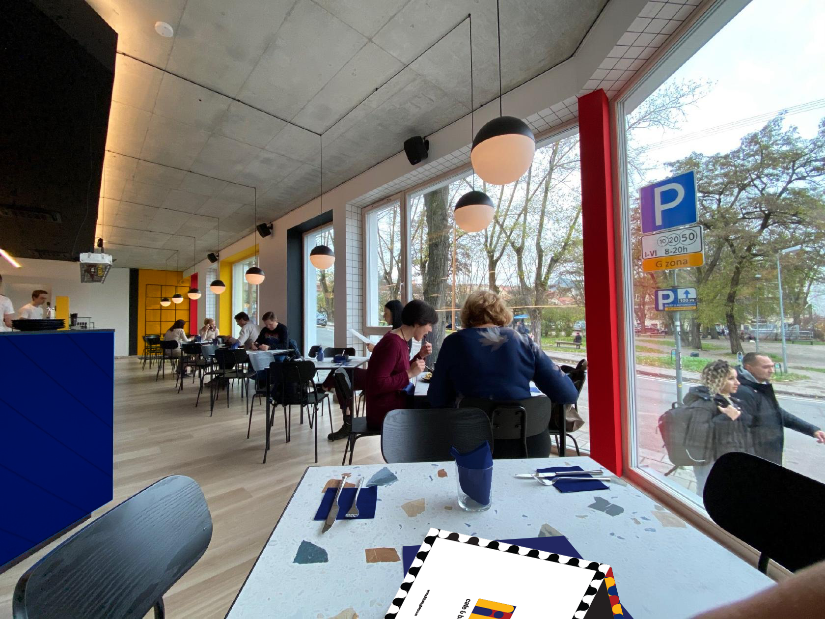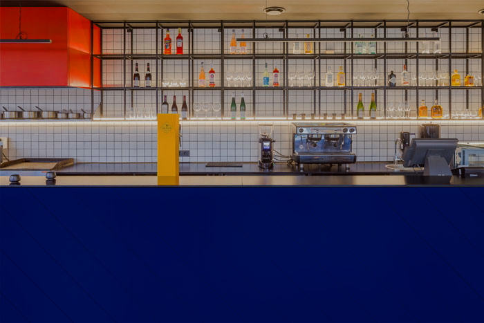
Lili is a cafe & bar located in downtown Bogotá, Colombia. The visual identity of this lounge like spot in the heart of the city is based on Bauhaus design, as a representation of the influence of art & design industry in South America, more specifically, Colombia. The palette depicts the Colombian flag, and the name Lili was born from familiar influence.
Logo Thumbnails
Throughout this stage, I began to experiment with geometrical symbols and word-marks that could potentially make it to the next stage of the design process. The final thumbnails were sketched on a grid to keep Bauhaus’ symmetrical and clean visual characteristics. The thumbnail stage allowed me to see what could work.
Concept
Lili is a captivating cafe & bar nested in the heart of Bogotá, Colombia. The visual identity of the establishment is based on Bauhaus design, as a representation of its influence of art, design, and architecture in South America. The colors draw inspiration from the rich palette of the Colombian flag. This avant-garde space marries design, culture, and taste, creating a unique and immersive experience.
Color Palette
The color palette is a symphony of vibrant colors inspired by the Colombian flag, incorporating the iconic yellow, blue, and red. These colors symbolize the lush landscapes, clear skies, and the fiery spirit of Colombia. We aim to create an atmosphere that resonates with the nation's cultural identity while honoring the groundbreaking spirit of the Bauhaus movement.
#0A2A6E
#FAB416
#AF1E23
Final Logo
Design Inspiration
The Bauhaus movement's legacy serves as the guiding force behind the design, embodying its principles of minimalism, functionality, and the harmonious fusion of form and function, integrating them seamlessly with the warmth of Colombian culture. The pattern across the several touchpoint adds fluidity and cohesiveness to the overall visual look of the brand.
Typography
The font for the logo was created based on the pattern we created for the menu and illustrations. The body text family used in most of LILI’s touchpoints is Coolvetica. This family embodies the movement's core principles of minimalism and functionality.
These fonts are characterized by clean, simple lines and a focus on legibility. In a cafe and bar setting, where information like menu items, signage, and event details must be clear and concise. Coolvetica, a cooler helvetica, is an excellent font choice that ensures ease of reading and understanding.
B&W Logotype
Body Text


Atmosphere
LILI offers a multifaceted atmosphere. During the day, natural light floods through expansive windows, creating a welcoming, airy ambiance. Patrons can engage in conversations, work, or relax amidst the tranquil, minimalist décor. As the sun sets, soft, strategic lighting transforms the space into an intimate haven, perfect for unwinding and socializing.
Culinary Experience
Our menu is an amalgamation of Colombian culinary heritage and contemporary global influences. Savor a cup of meticulously brewed Colombian coffee or indulge in innovative cocktails that incorporate locally sourced ingredients. Our kitchen serves simple but traditional Colombian dishes that please a diverse palate.


